結果の可視化
Package versions
このページのコードは、以下の要件を使用して開発されました。 これらのバージョン以降を使用することを推奨します。
qiskit[all]~=2.5.2
ヒストグラムのプロット
plot_histogram 関数は、QPU上で量子回路をサンプリングした結果を可視化します。
この関数は matplotlib.Figure オブジェクトを返します。コードセルの最後の行がこれらのオブジェクトを出力する場合、Jupyterノートブックはセルの下に表示します。他の環境やスクリプトでこれらの関数を呼び出す場合は、明示的に出力を表示または保存する必要があります。
2つのオプションがあります:
- 返されたオブジェクトに対して
.show()を呼び出し、新しいウィンドウで画像を開きます(設定されたmatplotlibバックエンドがインタラクティブであることが前提です)。 .savefig("out.png")を呼び出し、現在の作業ディレクトリのout.pngに図を保存します。savefig()メソッドはパスを受け取るため、出力を保存する場所とファイル名を調整できます。例えば、plot_state_city(psi).savefig("out.png")のように使用します。
例として、2量子ビットのベル状態を作成します:
# Added by doQumentation — installs the packages this notebook needs if they are missing
import importlib.util

_needed = {"matplotlib": "matplotlib", "numpy": "numpy", "qiskit": "qiskit"}
_missing = [pip for module, pip in _needed.items()
            if importlib.util.find_spec(module) is None]
# One at a time, so a package that fails to install does not block the others
for _pip in _missing:
    %pip install -q {_pip}
if not _missing:
    print("\u2713 All required packages are installed")
from qiskit.primitives import StatevectorSampler as Sampler
from qiskit.transpiler import generate_preset_pass_manager

from qiskit.circuit import QuantumCircuit
from qiskit.visualization import plot_histogram
# Quantum circuit to make a Bell state
bell = QuantumCircuit(2)
bell.h(0)
bell.cx(0, 1)
bell.measure_all()

pm = generate_preset_pass_manager(optimization_level=1)
isa_circuit = pm.run(bell)

# execute the quantum circuit
sampler = Sampler()
job = sampler.run([isa_circuit])
result = job.result()

print(result)
PrimitiveResult([SamplerPubResult(data=DataBin(meas=BitArray(<shape=(), num_shots=1024, num_bits=2>)), metadata={'shots': 1024, 'circuit_metadata': {}})], metadata={'version': 2})
plot_histogram(result[0].data.meas.get_counts())

ヒストグラムをプロットする際のオプション
plot_histogram の以下のオプションを使用して、出力グラフを調整できます。
-
legend: 実行結果にラベルを付けます。各実行結果にラベルを付けるための文字列のリストを受け取ります。主に同じヒストグラムに複数の実行結果をプロットする場合に便利です。 -
sort: ヒストグラムのバーの順序を調整します。ascで昇順、descで降順に設定できます。 -
number_to_keep: 表示する項目数を整数で指定します。残りは「rest」という単一のバーにまとめられます。 -
color: バーの色を調整します。各実行のバーに使用する色を文字列または文字列のリストで指定します。 -
bar_labels: バーの上にラベルを表示するかどうかを調整します。 -
figsize: 出力図のサイズ(インチ単位)のタプルを受け取ります。
# Execute two-qubit Bell state again

job = sampler.run([isa_circuit], shots=1000)
second_result = job.result()

# Plot results with custom options
plot_histogram(
    [
        result[0].data.meas.get_counts(),
        second_result[0].data.meas.get_counts(),
    ],
    legend=["first", "second"],
    sort="desc",
    figsize=(15, 12),
    color=["orange", "black"],
    bar_labels=False,
)

Estimatorの結果をプロットする
Qiskitには Estimator の結果をプロットするための組み込み関数はありませんが、Matplotlibの bar プロット を使って手軽に可視化できます。
デモとして、以下のセルでは量子状態における7種類のオブザーバブルの期待値を推定します。
import numpy as np
from qiskit import QuantumCircuit
from qiskit.quantum_info import SparsePauliOp
from qiskit.primitives import StatevectorEstimator as Estimator
from qiskit.transpiler import generate_preset_pass_manager
from matplotlib import pyplot as plt

# Simple estimation experiment to create results
qc = QuantumCircuit(2)
qc.h(0)
qc.crx(1.5, 0, 1)

observables_labels = ["ZZ", "XX", "YZ", "ZY", "XY", "XZ", "ZX"]
observables = [SparsePauliOp(label) for label in observables_labels]

pm = generate_preset_pass_manager(optimization_level=1)
isa_circuit = pm.run(qc)
isa_observables = [
    operator.apply_layout(isa_circuit.layout) for operator in observables
]

# Reshape observable array for broadcasting
reshaped_ops = np.fromiter(isa_observables, dtype=object)
reshaped_ops = reshaped_ops.reshape((7, 1))

estimator = Estimator()
job = estimator.run([(isa_circuit, reshaped_ops)])
result = job.result()[0]
exp_val = job.result()[0].data.evs
print(result)

# Since the result array is structured as a 2D array where each element is a
# list containing a single value, you need to flatten the array.

# Plot using Matplotlib
plt.bar(observables_labels, exp_val.flatten())
PubResult(data=DataBin(evs=np.ndarray(<shape=(7, 1), dtype=float64>), stds=np.ndarray(<shape=(7, 1), dtype=float64>), shape=(7, 1)), metadata={'target_precision': 0.0, 'circuit_metadata': {}})
<BarContainer object of 7 artists>

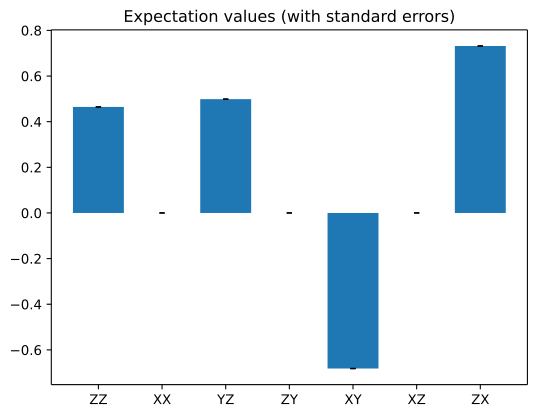
以下のセルでは、各結果の推定標準誤差を使用し、エラーバーとして追加します。プロットの詳細については bar プロットのドキュメント を参照してください。
standard_error = job.result()[0].data.stds

_, ax = plt.subplots()
ax.bar(
    observables_labels,
    exp_val.flatten(),
    yerr=standard_error.flatten(),
    capsize=2,
)
ax.set_title("Expectation values (with standard errors)")
Text(0.5, 1.0, 'Expectation values (with standard errors)')